When botanical photographs and illustrations are merged together with bold typography, the results are beautiful and convey a great sense of depth. Here are some of our favs – just in time for spring.
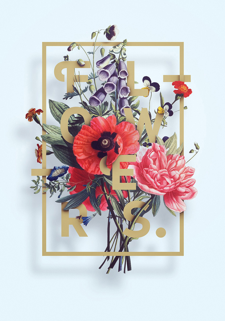
Think Outside the Box
These gorgeous poster compositions designed by Aleks Gusakov are part of his «Flowers» Poster Series. There is so much depth to his work, giving the illusion that the flowers are suspended in air.
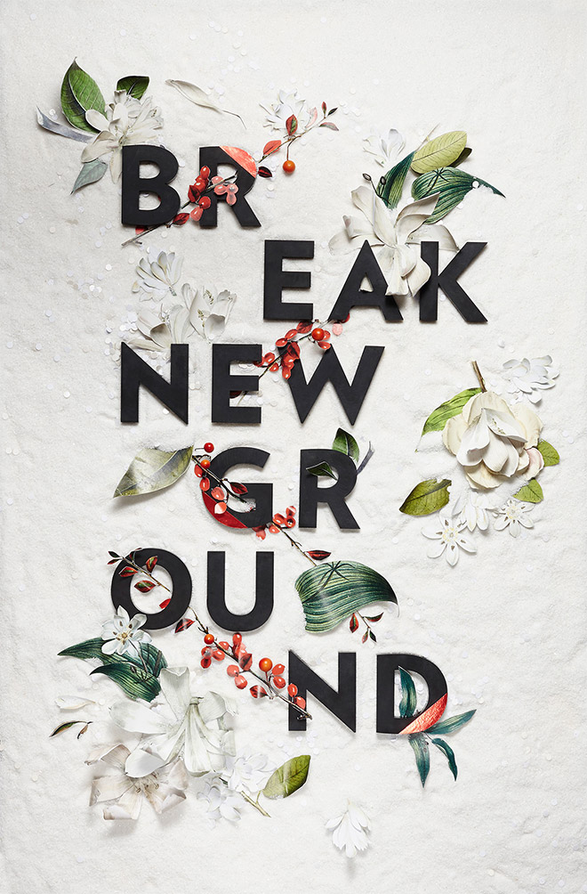
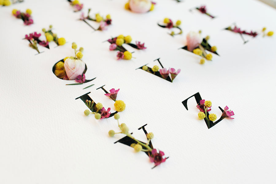
Holiday Campaign for Etsy
Melissa Deckert and Nicole Licht designed the holiday mailers for Etsy using still-life compositions made up of three-dimensional letters placed among cutouts of floral graphics.
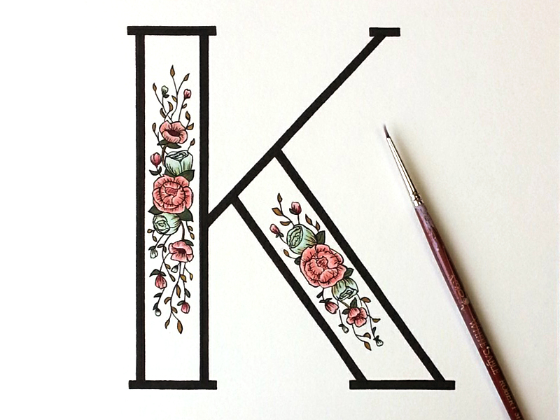
Decorative Drop Caps
These hand-painted drop caps by Kelsey Phillips achieve a perfect balance between modern and traditional. The ample space in the contemporary body of the type showcases her artisanal, folkloric hand-painted motifs.
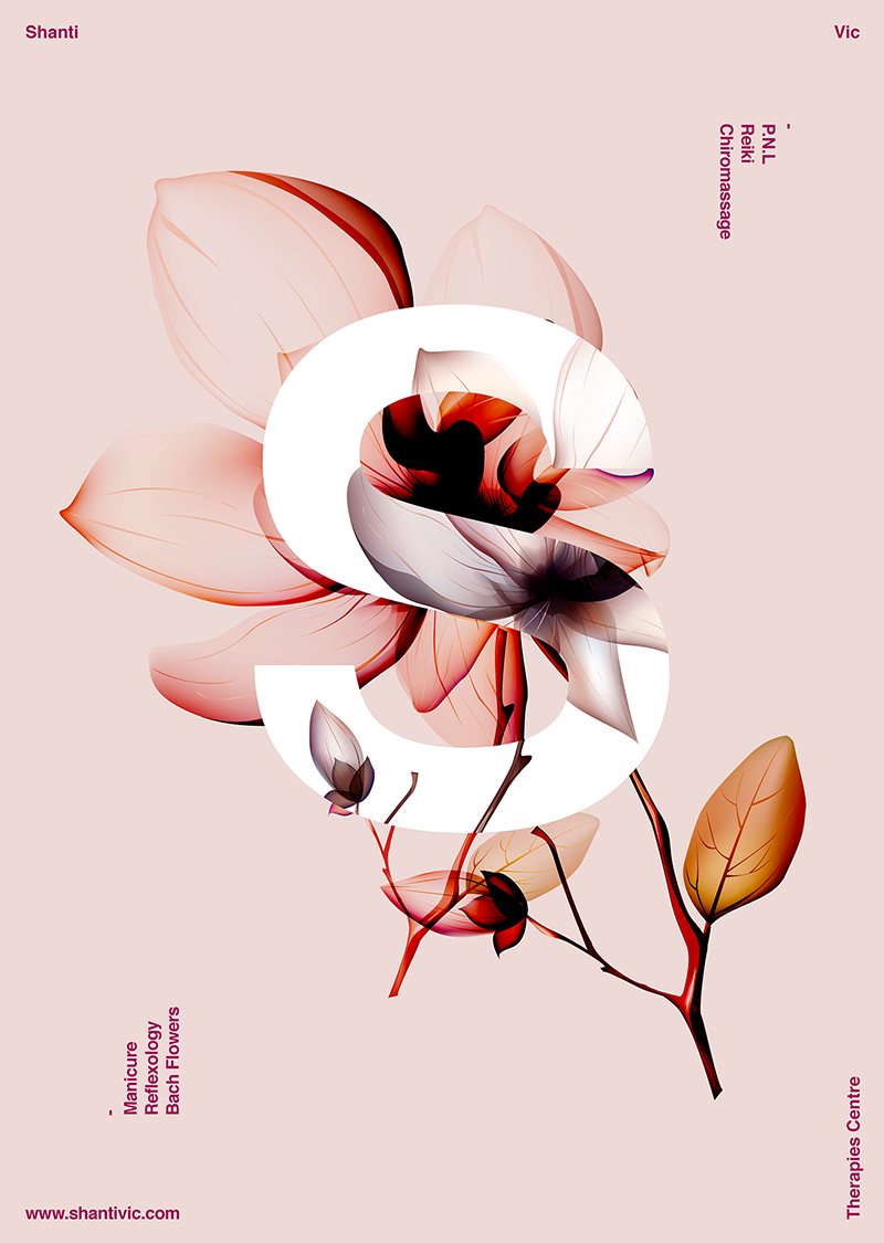
Inverted Contrasts
Xavier Esclusa created this beautiful poster showcasing the intricate anatomy of the flower in the manner of being observed under an x-ray. His use of dark purple shadows stand out against the soft nudes and subtle pinks of the background.
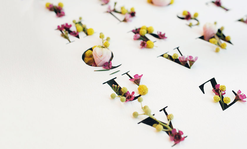
The Secret Garden
Inspired by themes drawn from The Secret Garden, the florals are partially hidden behind the typeface by Emma Luk. This is meant to avoke the intrigue of the characters not finding access to the garden until the robin leads Mary to find the key.
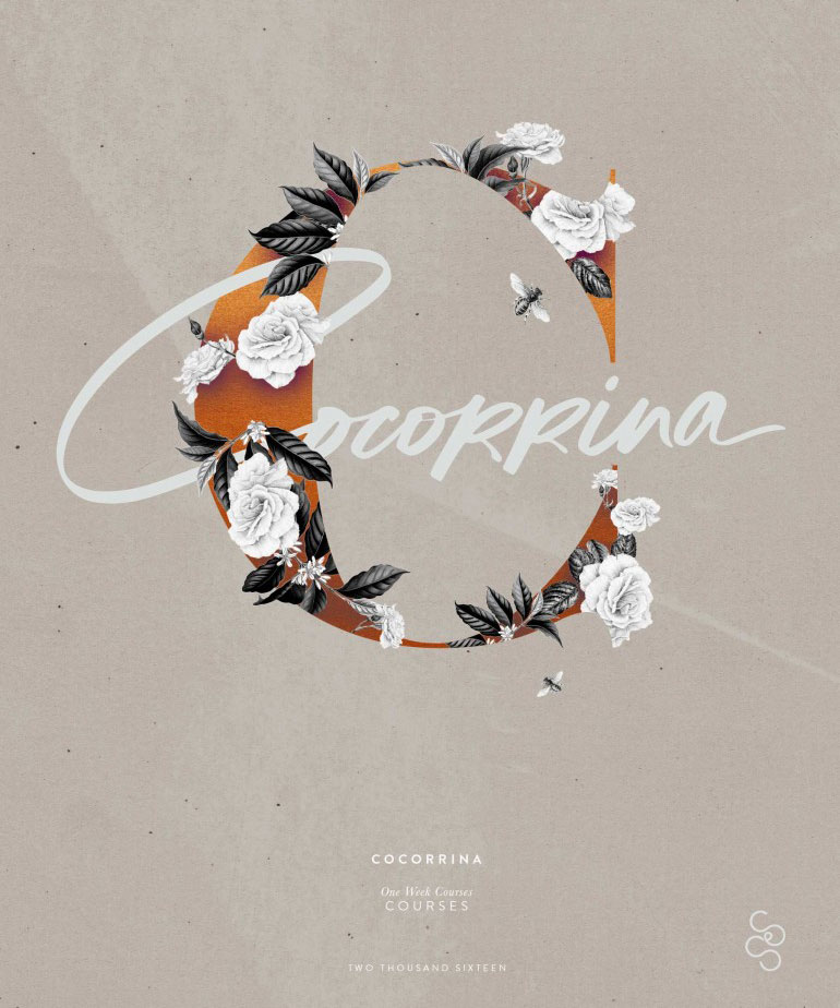
A Lovely Font Pairing
This poster design by Corina Nika showcases a lovely pairing between a classic humanistic sans-serif typeface and a hand-drawn brush script. I love the colors and textures of this piece – particularly that of the clementine which serves as the base of the “C”.
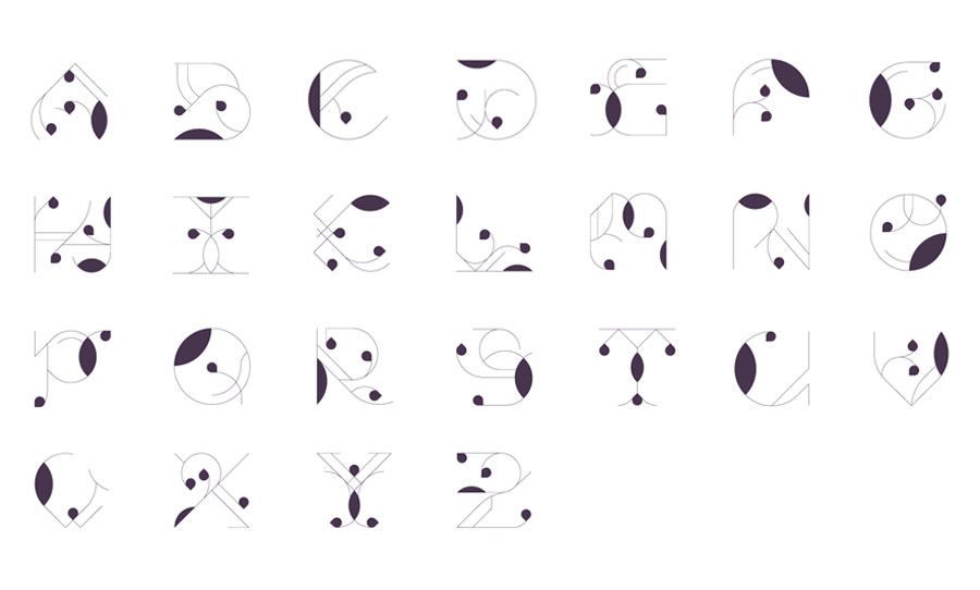
Geometric Floral Typeface
Teo Gagliano designed a display typeface called “NSWE” (North South West East) featuring high contrasts in the font’s weight using graphical stems and leaves.
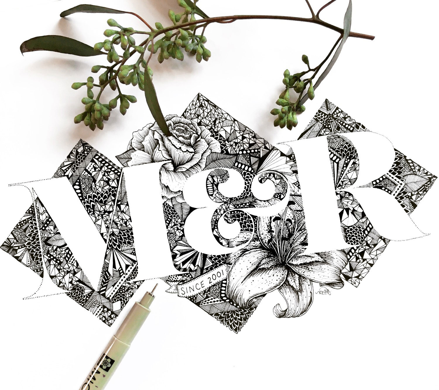
Hand-drawn Lettering
These botanical monogram illustrations by Maggie Sichter are intricately drawn in black ink.
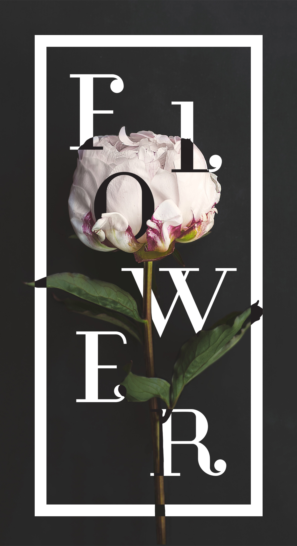
Dark & Light Simplicity
I love this simple yet elegant design by Hillary Barron. The edges of each layer is defined by color inversions and using the multiply effect. The body and rounded terminal of the typeface resembles the curve of the flower petals. The narrow format invites the viewer to take in the entire piece inclusive of all three layers.